No More Drop-Offs
The redesign of the sign-up and log-in flow aimed to enhance user experience by eliminating confusion and friction during account creation and access. By addressing key pain points identified through user research, we sought to create a more intuitive and streamlined process that facilitates user onboarding and boosts retention.
The Challenge
Our users faced a frustrating experience when trying to create accounts and log in. The original sign-up and sign-in processes were not only cumbersome but also confusing due to similar wording. This led to a high rate of abandoned registrations and overwhelming support requests.
Cluttered interface
I transformed the overwhelming design into a clean and organised layout, streamlining user navigation and enhancing overall visual clarity.
Unclear error handling
By introducing clear error messages and guidance, I aimed to reduce user frustration and facilitate mistake recovery.
Unnecessary steps
I simplified the sign-up and log-in processes to make account creation and access quicker and more efficient.
I simplified the sign-up and log-in processes to make account creation and access quicker and more efficient for the users.
Cluttered interface
I transformed the overwhelming design into a clean and organised layout, streamlining user navigation and enhancing overall visual clarity.
Unclear error handling
By introducing clear error messages and guidance, I aimed to reduce user frustration and facilitate mistake recovery.
Unnecessary steps
I streamlined the sign-up and log-in processes for faster account creation and access.
A 30% sign-up drop-off revealed verification as a bottleneck, risking our competitive edge
A 30% sign-up drop-off revealed verification as a bottleneck, risking our competitive edge
Making The Right Moves
The Right Moves
To address these challenges, I conducted usability testing to evaluate the sign-up and log-in process. Through testing, I uncovered key insights into user behavior and preferences, which directly influenced the improvements in the flow.
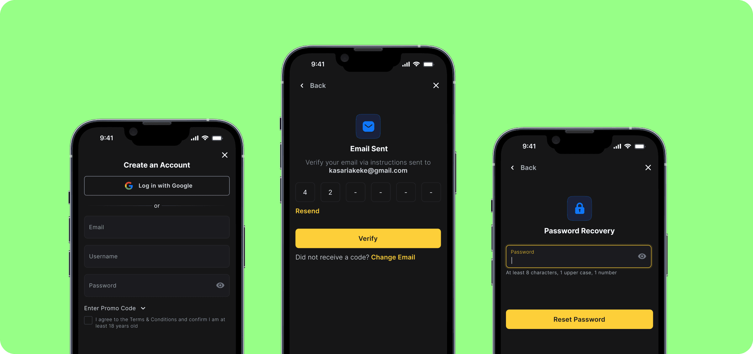
Clarity in password requirements
Users struggled with password criteria due to unclear feedback. I added a password strength indicator for immediate visual cues.
Simplified Error Messaging
Ambiguous error messages confused users during log-in. I replaced them with clearer, more helpful messages.
Simplified Verification
I simplified the verification process by removing unnecessary mobile verification, making the flow more intuitive and reducing friction for users.

The enhancements boosted sign-ups by 30% and cut support requests by 20%, improving user experience.
The enhancements boosted sign-ups by 30% and cut support requests by 20%, improving user experience.
The Final Look
High-fidelity design represents the final stages of the design process, offering detailed, polished visuals


Key Takeaways
Streamline Processes for Efficiency
By simplifying the verification process and eliminating unnecessary steps, we made account creation faster and more intuitive, ultimately improving user satisfaction
Effective Error Handling Matters
Implementing clear error messages and guidance proved essential in minimizing user frustration and facilitating smoother recovery from mistakes.
Iterate and Test Continuously
We learned the importance of continuous testing and iteration based on user feedback, allowing us to refine the design and enhance the user journey effectively.


No More Drop-Offs
The redesign of the sign-up and log-in flow aimed to enhance user experience by eliminating confusion and friction during account creation and access. By addressing key pain points identified through user research, we sought to create a more intuitive and streamlined process that facilitates user onboarding and boosts retention.
The Challenge
Our users faced a frustrating experience when trying to create accounts and log in. The original sign-up and sign-in processes were not only cumbersome but also confusing due to similar wording. This led to a high rate of abandoned registrations and overwhelming support requests.
Cluttered interface
I transformed the overwhelming design into a clean and organised layout, streamlining user navigation and enhancing overall visual clarity.
Unclear error handling
By introducing clear error messages and guidance, I aimed to reduce user frustration and facilitate mistake recovery.
Unnecessary steps
I simplified the sign-up and log-in processes to make account creation and access quicker and more efficient.
Cluttered interface
I transformed the overwhelming design into a clean and organised layout, streamlining user navigation and enhancing overall visual clarity.
Unclear error handling
By introducing clear error messages and guidance, I aimed to reduce user frustration and facilitate mistake recovery.
Unnecessary steps
I streamlined the sign-up and log-in processes for faster account creation and access.
A 30% sign-up drop-off revealed verification as a bottleneck, risking our competitive edge
Making The Right Moves
To address these challenges, I conducted usability testing to evaluate the sign-up and log-in process. Through testing, I uncovered key insights into user behavior and preferences, which directly influenced the improvements in the flow.
Clarity in password requirements
Users struggled with password criteria due to unclear feedback. I added a password strength indicator for immediate visual cues.
Simplified Error Messaging
Ambiguous error messages confused users during log-in. I replaced them with clearer, more helpful messages.
Simplified Verification
I simplified the verification process by removing unnecessary mobile verification, making the flow more intuitive and reducing friction for users.
The enhancements boosted sign-ups by 30% and cut support requests by 20%, improving user experience.
The Final Look
High-fidelity design represents the final stages of the design process, offering detailed, polished visuals
Key Takeaways
Streamline Processes for Efficiency
By simplifying the verification process and eliminating unnecessary steps, we made account creation faster and more intuitive, ultimately improving user satisfaction
Effective Error Handling Matters
Implementing clear error messages and guidance proved essential in minimizing user frustration and facilitating smoother recovery from mistakes.
Iterate and Test Continuously
We learned the importance of continuous testing and iteration based on user feedback, allowing us to refine the design and enhance the user journey effectively.