A System That Scales
As the product grew, maintaining a consistent user experience across platforms became challenging. Fragmented design processes led to inconsistent UI, longer development times, and a disjointed brand identity. The design system aimed to create a single source of truth, ensuring consistency, scalability, and efficiency across all products.

The Challenge
Each time we began a new project or phase, we started from scratch, repeatedly setting up new component libraries. This led to redesigning the same components with varying styles for different functionalities. We realized the need to streamline our process by recreating existing components and compiling all previous and new use cases.
Design System Goals
The lack of a centralized design system led to several issues:
Ensure Consistency
Develop a consistent design system that ensures all products share the same style.
Improve Efficiency
Streamline the design and development process by providing reusable components.
Enhance Scalability
Build a flexible system that could easily adapt to new products or platforms.
Making The Right Moves
After reviewing our design assets, we took inspiration from systems like Material Design and Carbon, and embraced Atomic Design to build smarter—starting with simple components and scaling up to complex patterns.

Building the Design System
We developed and documented the following key components:
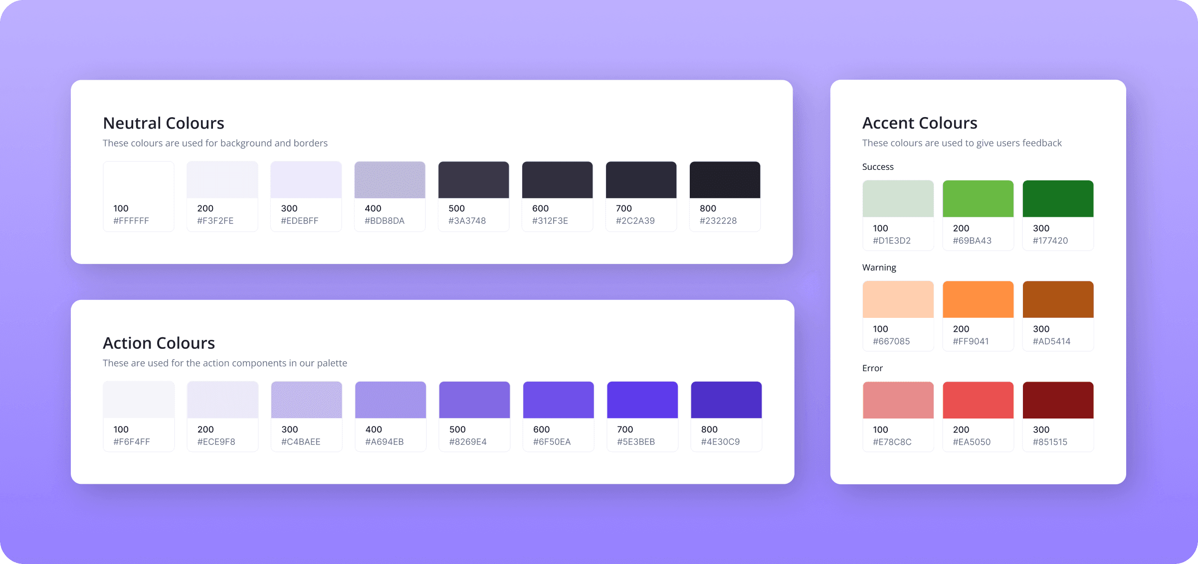
Color Palette
Typography
A hierarchical system of fonts, including size, weight, and spacing guidelines for different contexts.
Buttons
Form Elements
Standardized input fields, dropdowns, checkboxes, and radio buttons with error states.
Icons
I designed a custom icon set tailored to reflect and reinforce our brand's visual language.
Grids and Spacing
Colors
While building design system, I tackled color challenges like inconsistency, accessibility, and scalability by implementing a structured, versatile approach. First, I created color tokens for primary, secondary, and accent colors.
To address accessibility, I established minimum contrast ratios, making content readable and inclusive, even in low-contrast settings.
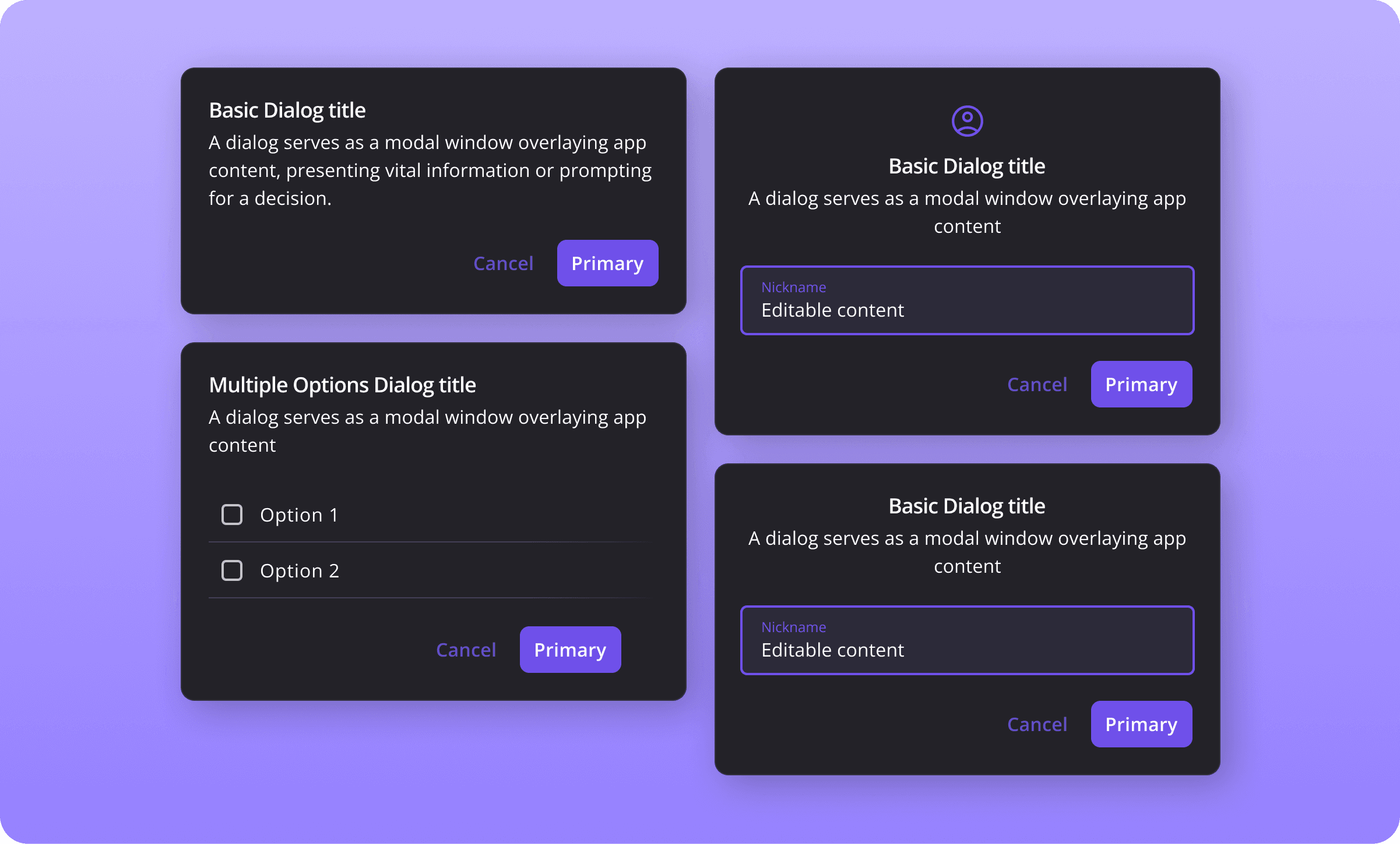
Dialogs
Inconsistent popup placement and behavior across products can fragment the user experience, as varied locations and triggers often lead to confusion. Establishing standardized patterns within the design system, including default placements, consistent entry/exit animations, and fallback positioning, helps ensure a cohesive and predictable user interaction across all products.
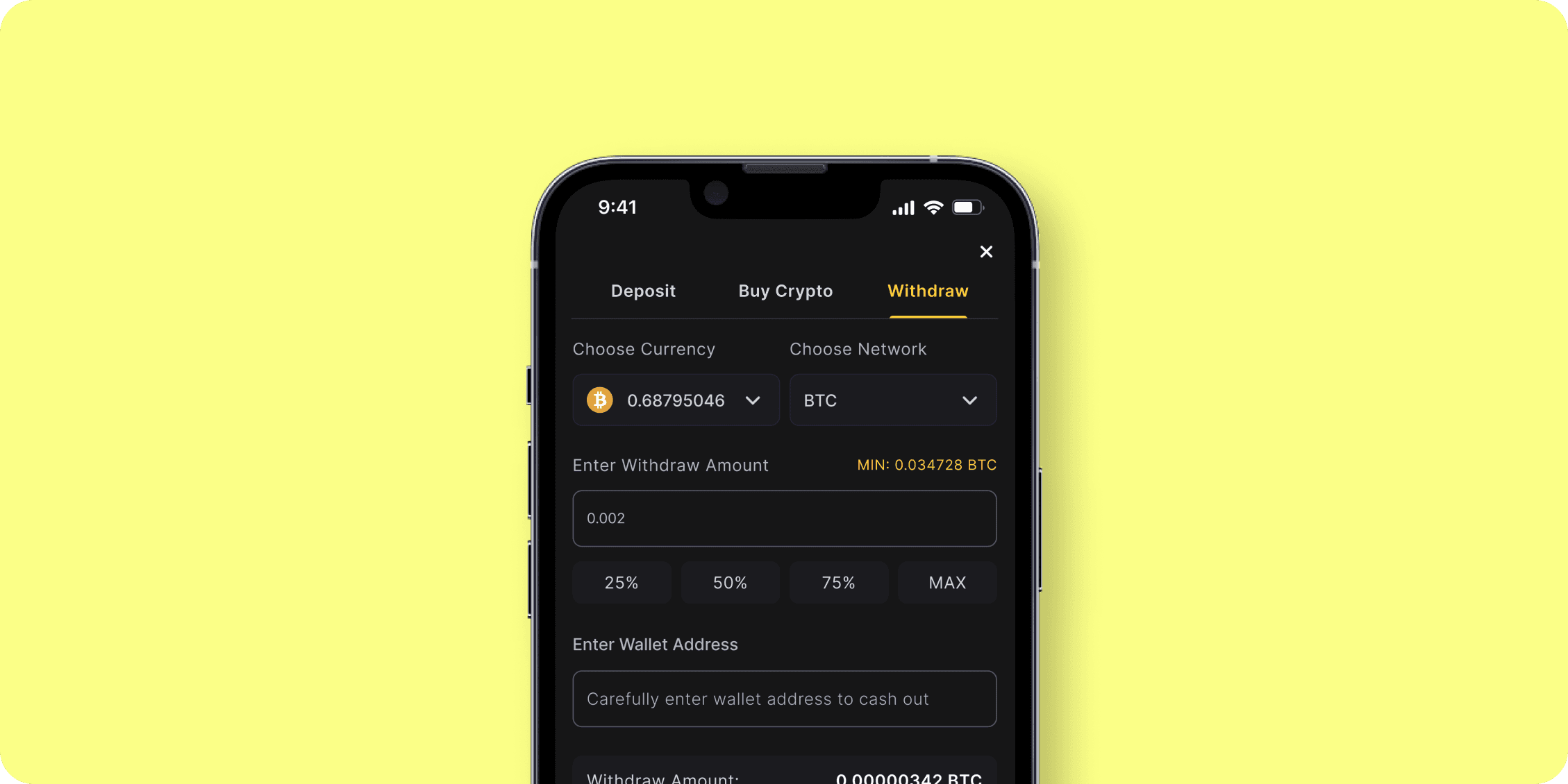
Inputs
Inputs encounter challenges like poor feedback, inconsistent placeholders, and unclear error messaging. I addressed these by adding clear focus indicators and hover states, ensuring each input has a visible label while reserving placeholders for brief hints. Additionally, I standardized error messages with red text and icons to clarify issues and improve user understanding of validation rules.

What We Achieved
Faster Development Cycles
With a library of reusable components and clear documentation, developers experienced a 30% reduction in development time for new features, allowing them to focus on higher-value tasks rather than reinventing design elements for each project.
Scalability and Flexibility
The modular nature of the design system allowed for easy updates and scalability, enabling the company to launch new features 30% faster in response to changing user needs and market trends.
Clear Brand Identity
A well-defined color palette, typography, and component library reinforced the company’s brand identity, resulting in a 20% increase in brand recognition.