Search That Works
The search feature initially struggled with a complex structure and an overwhelming number of categories. To create a more seamless experience, we reorganized the data into predefined categories and prioritized a mobile-first approach, anticipating the needs of future users. Through iterative testing and feedback, we refined the design to ensure it is intuitive, efficient, and aligned with stakeholder expectations.

The Challenge
At the onset of the project, we encountered numerous challenges with the proposed search function.
Complex structure
Too many filters and nested categories made it hard for users to know where to start, causing frustration and drop-offs.
Poorly Ranked Results
Irrelevant results at the top reduced trust, and the lack of personalization made searches less effective.
No Error Handling
Without suggestions or guidance, users struggled to adjust queries when no results appeared, leading to abandoned searches.
Wireframes
In the wireframing phase, we focused on creating a simple layout. The initial sketches explored ways to highlight predefined categories and integrate key features like real-time suggestions. We iterated on several versions to ensure the design minimized cognitive load, making it easy for users to explore and refine their searches.
Data Organization
We decided to consolidate all existing data into 20 distinct categories, simplifying the user experience by allowing users to select from predefined categories. To improve discoverability, we chose to highlight these categories before after users initiated a search
Simple categories
To tackle the issue of overwhelming filters and categories, I plan to streamline the options by reducing the number of filters and organizing categories into broader, more intuitive groups. This simplification will help users quickly identify relevant options.
My Response
To address these challenges, I took immediate and decisive steps:
Change category layout
I redesigned the category layout to reduce cognitive overload by logically grouping related categories and prioritizing the most frequently used ones, ensuring users feel less overwhelmed while searching.
Added suggestions
I introduced suggestions for modifying queries, like “Did you mean…?” and related keywords, to empower users to refine their searches and discover relevant results more effortlessly.

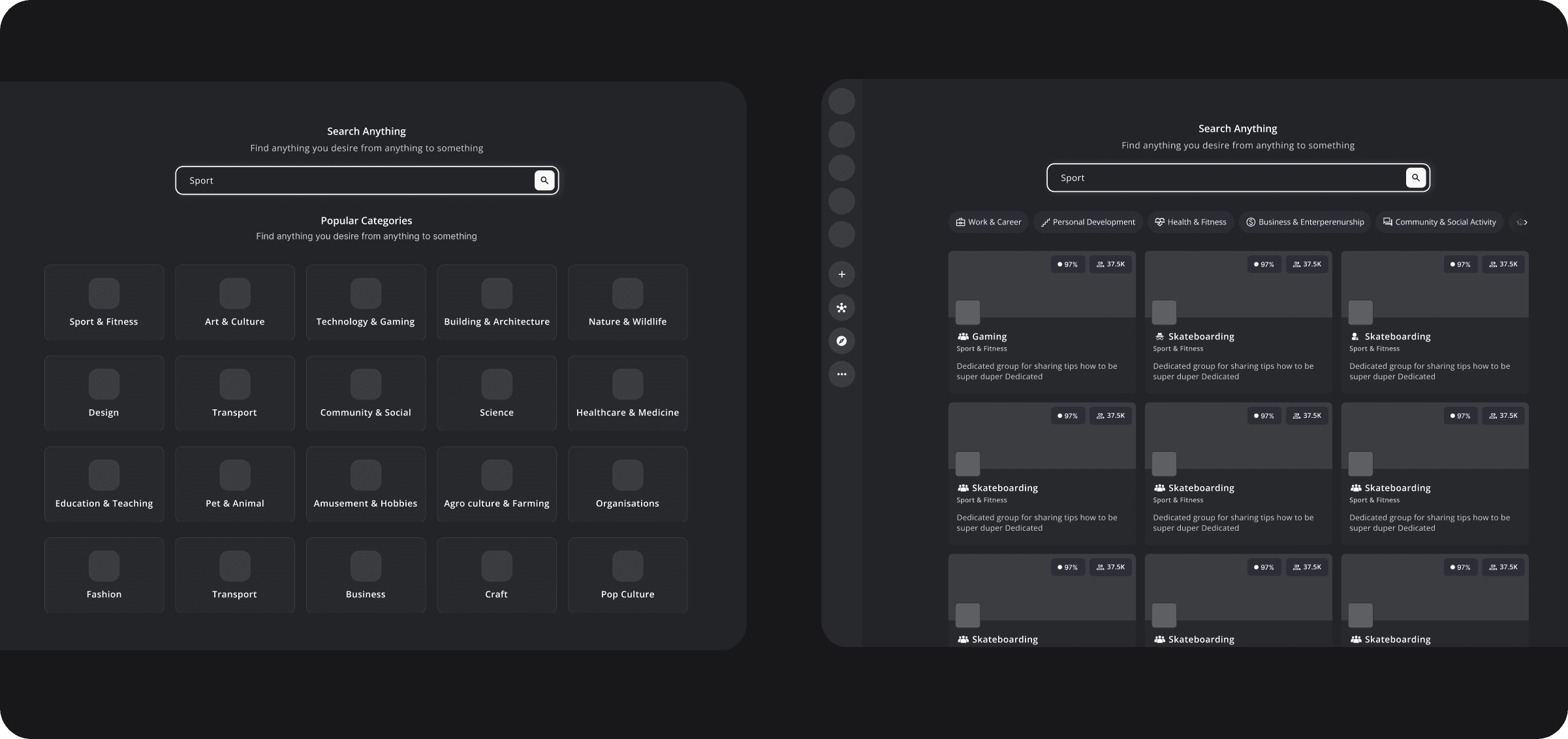
The Final Look
High-fidelity prototypes were developed to refine the user interface and interactions based on the initial wireframes. Key enhancements included:
Simple structure
Consolidated the data into 8 categories and highlighted them before search
Autocomplete and Suggestions
Implemented real-time suggestions to minimize effort as users type.
Clear no results page
Aded typo-tolerant “Did you mean...?” prompts to prevent dead ends.


Key Takeaways
Collaboration Across Teams
We learned the necessity of collaboration across teams. Engaging with operations and design teams ensured that our enhancements were seamlessly integrated into existing processes, making the user experience more cohesive.
Simplify User Experience
We recognized the importance of simplifying the user experience by consolidating data into broader categories. This approach not only made navigation easier but also allowed users to make selections more intuitively.